
Levelling up Meal Planning with Gamification
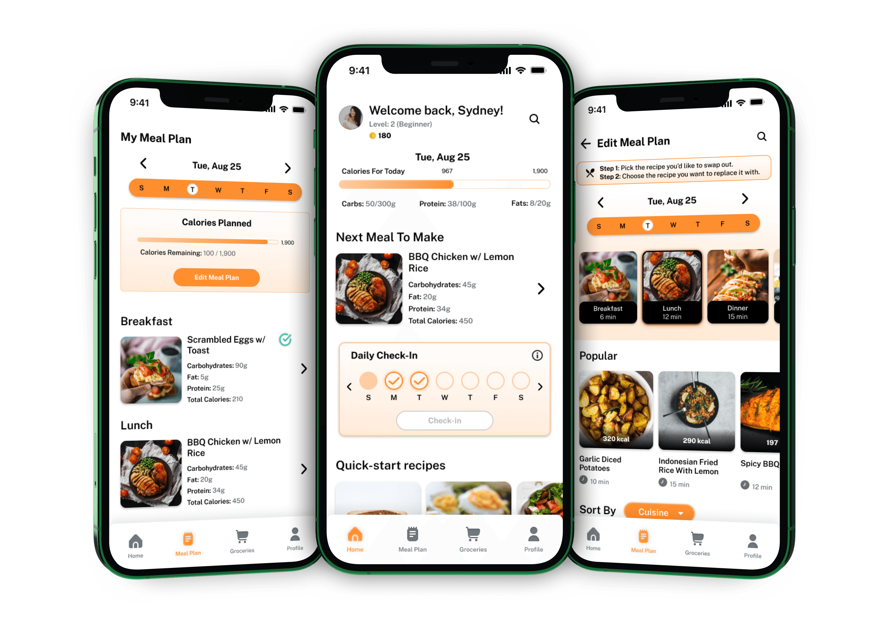
In a fast-paced world where schedules are tight and cooking skills vary, the task of maintaining a balanced diet can be daunting. Our goal? To develop an app that simplifies meal planning and cooking, making it an engaging experience for users of all levels while promoting healthy eating habits.
Project Type
Design Challenge
UX Designer, UX Researcher, Interaction Designer
5 weeks
Miles Carter, Shaunak Chattopadhyay
Figma, Miro
Challenge
Our challenge lay in developing an application that not only simplified meal planning but also made it a motivating and enjoyable experience. We needed to infuse elements of gamification to keep users engaged, offer a diverse range of recipes to satisfy varied tastes, and provide personalized meal plans tailored to individual schedules and dietary preferences. All of this had to be accomplished while alleviating the stress often associated with meal preparation and decision-making.
Results
The redesigned app features a clean, clutter-free interface, making it easier for users to navigate and access essential features.
The improved onboarding process resulted in a 35% increase in new user adoption rates.
The addition of personalization and customization options enhanced user engagement, leading to a 25% increase in user retention rates.
User satisfaction in overall functionality & design
Reduction in time spent on meal planning
Increase in daily user interactions


Recipe for Innovation: Stirring the Pot of Ideas
Research & Analysis: We conducted user interviews, surveys, and analyzed in-app analytics to understand the pain points and user needs. We also studied competitor apps and industry trends to gather insights
Information Architecture: Based on the research findings, we restructured the app's navigation and content, prioritizing features and information according to user needs.
Wireframing & Prototyping: We designed low-fidelity wireframes to visualize the new layout and navigation, iteratively refining them based on user feedback. Afterward, we built a high-fidelity, interactive prototype to test the design.
Usability Testing: We conducted usability tests with a diverse group of users to validate the design and identify areas for improvement. Based on the feedback, we made necessary adjustments to the design.
Visual Design & Style Guide: We developed a cohesive visual language, including color schemes, typography, and iconography, ensuring consistency throughout the app. We also created a style guide to maintain design consistency in future updates.
Crafting the Design Behind User Delight
Research & Analysis: We conducted user interviews, surveys, and analyzed in-app analytics to understand the pain points and user needs. We also studied competitor apps and industry trends to gather insights
Information Architecture: Based on the research findings, we restructured the app's navigation and content, prioritizing features and information according to user needs.
Wireframing & Prototyping: We designed low-fidelity wireframes to visualize the

“ With our new visual branding and language in place, the new Shopify brand clearly captures the essence of our current and target customer base, our employees, and our values. ”
Tobias Lütke
CEO, Co-founder | Shopify


Stress-Testing the App to Unearth Hidden Gems
Research & Analysis: We conducted user interviews, surveys, and analyzed in-app analytics to understand the pain points and user needs. We also studied competitor apps and industry trends to gather insights
Information Architecture: Based on the research findings, we restructured the app's navigation and content, prioritizing features and information according to user needs.
Wireframing & Prototyping: We designed low-fidelity wireframes to visualize the new layout and navigation, iteratively refining them based on user feedback. Afterward, we built a high-fidelity, interactive prototype to test the design.
Usability Testing: We conducted usability tests with a diverse group of users to validate the design and identify areas for improvement. Based on the feedback, we made necessary adjustments to the design.
Visual Design & Style Guide: We developed a cohesive visual language, including color schemes, typography, and iconography, ensuring consistency throughout the app. We also created a style guide to maintain design consistency in future updates.
Copy Paste from Figma
Install the Figma plugin and you’re ready to convert your designs to a responsive site.
Start with Site Templates
Browse dozens of professionally designed templates. Click, duplicate, customize.
From Data to Delight: Metrics & Impact
Research & Analysis: We conducted user interviews, surveys, and analyzed in-app analytics to understand the pain points and user needs. We also studied competitor apps and industry trends to gather insights
Information Architecture: Based on the research findings, we restructured the app's navigation and content, prioritizing features and information according to user needs.
Wireframing & Prototyping: We designed low-fidelity wireframes to visualize the
Recipes for Wisdom: Reflections & Insights
The StreamLine mobile banking app redesign successfully addressed the usability issues, resulting in a more intuitive and user-friendly experience. The improved UX/UI design led to increased user adoption, engagement, and satisfaction, demonstrating the value of a well-designed template for UX designers.